Neesh Chaudhary

I design brand-forward, AI-enabled products and the design systems underneath them. Most of my work is 0→1, making deeply technical systems legible and usable. I'm currently a Staff Experience Designer at Tenstorrent, the company's first product design hire.

I also run Topiary, an independent creative studio where I partner with emerging startups on brands and interfaces.

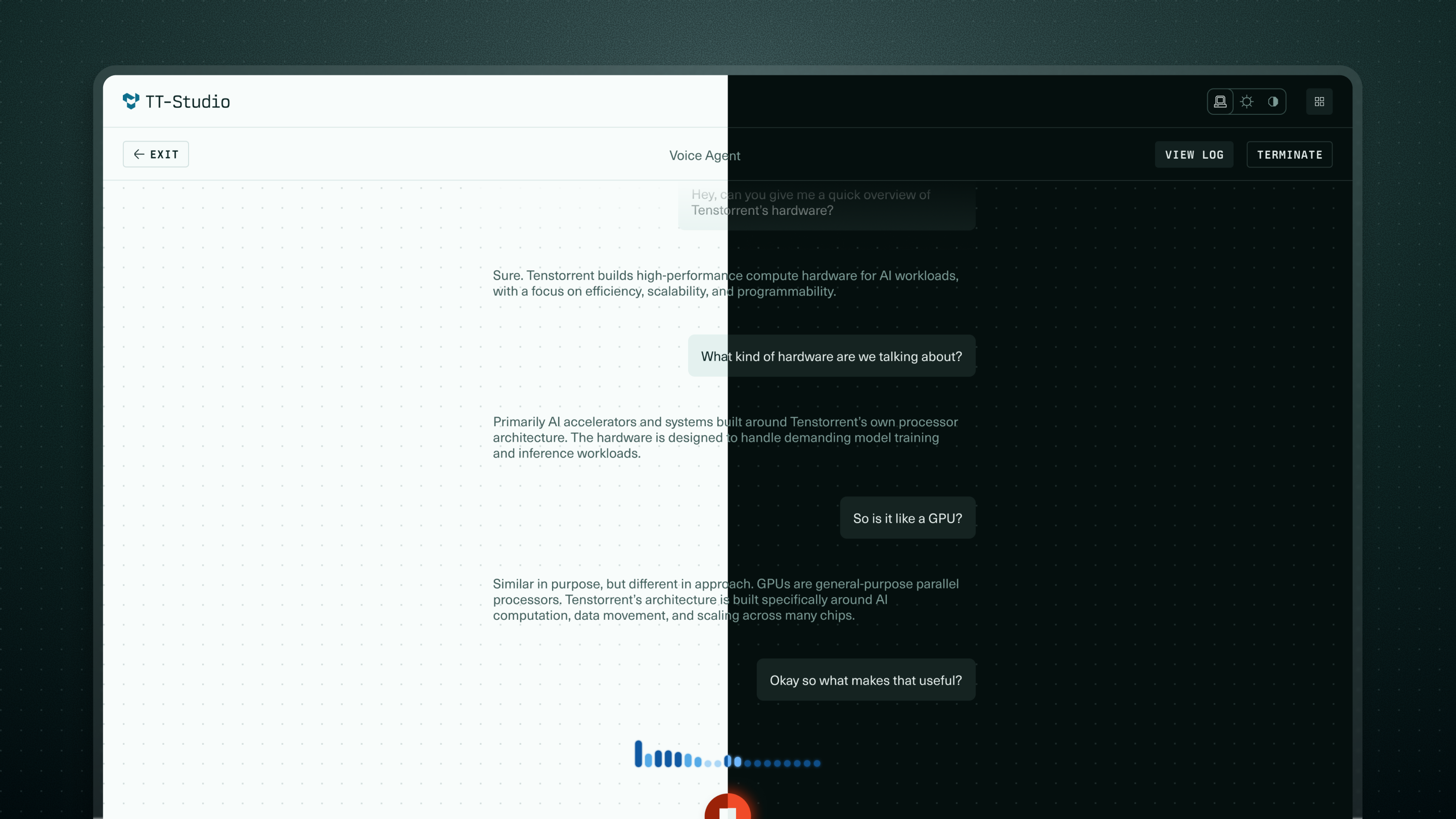
TT-Studio

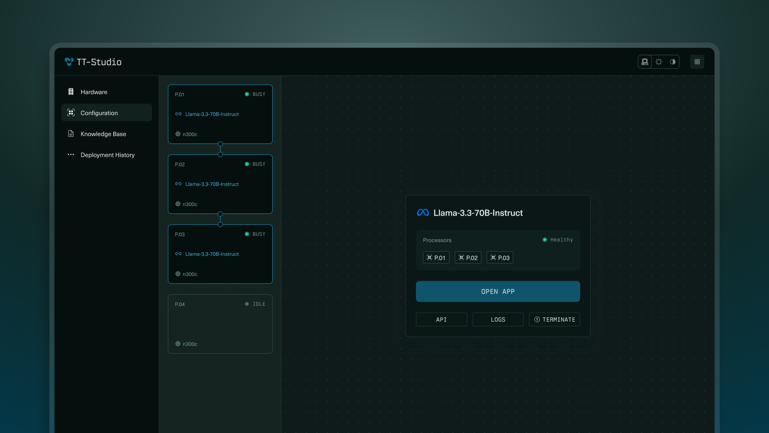
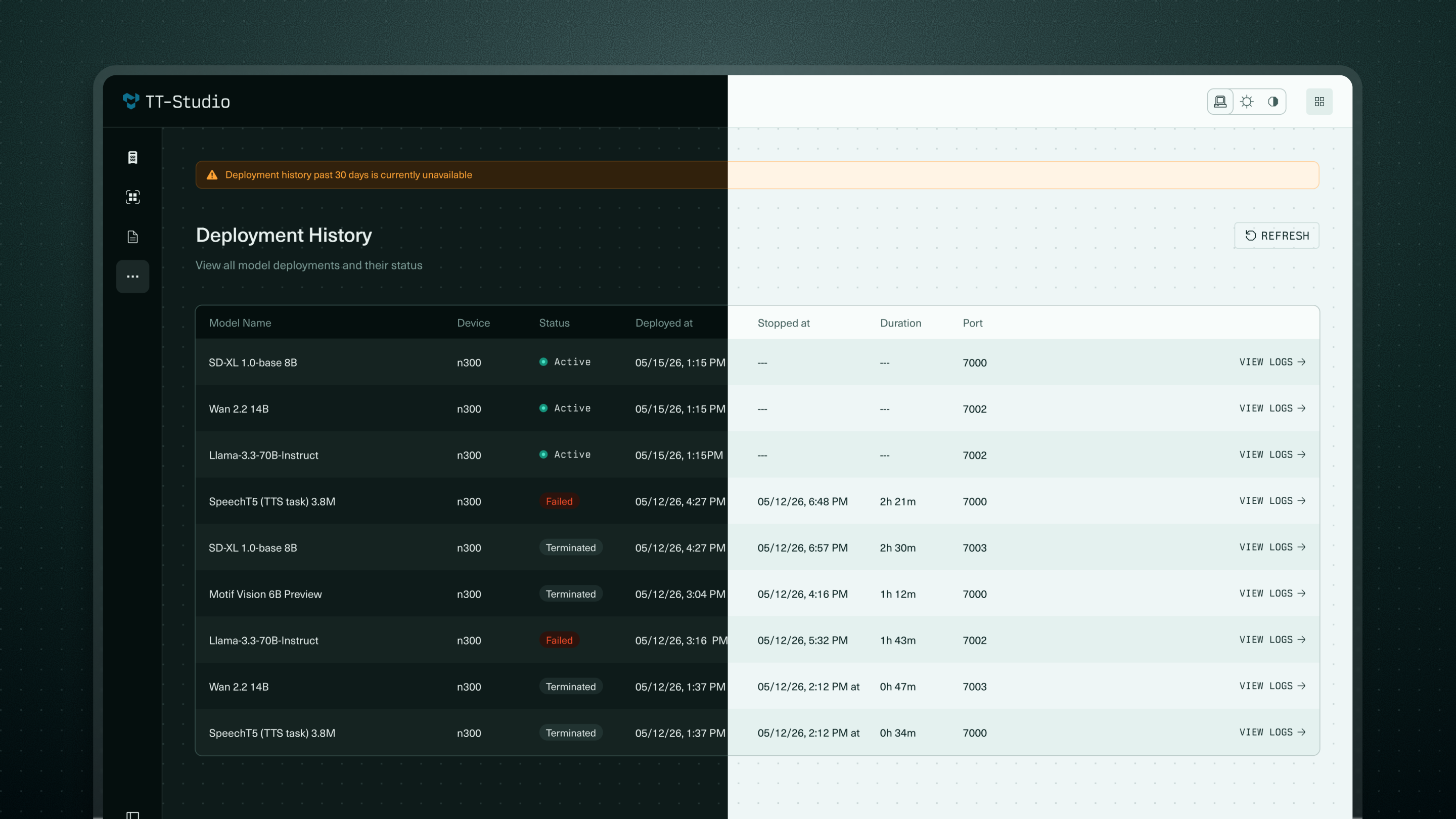
TT-Studio is a desktop app for deploying and running AI models on Tenstorrent hardware. The TT-QuietBox, Tenstorrent's desktop workstation, had an activation problem: getting a first model running meant hours in the terminal wading through raw logs and backend status.

I recognized a product opportunity in an internal demo a systems engineer had built, prototyped a user-facing version in Cursor to win leadership and CEO buy-in, and partnered with two engineers to design and ship it.

Role
Sole Product Designer
Duration
2025-2026
Team
  • Front End Developer
  • Systems Engineer
Tools
Figma, Cursor

The product problem

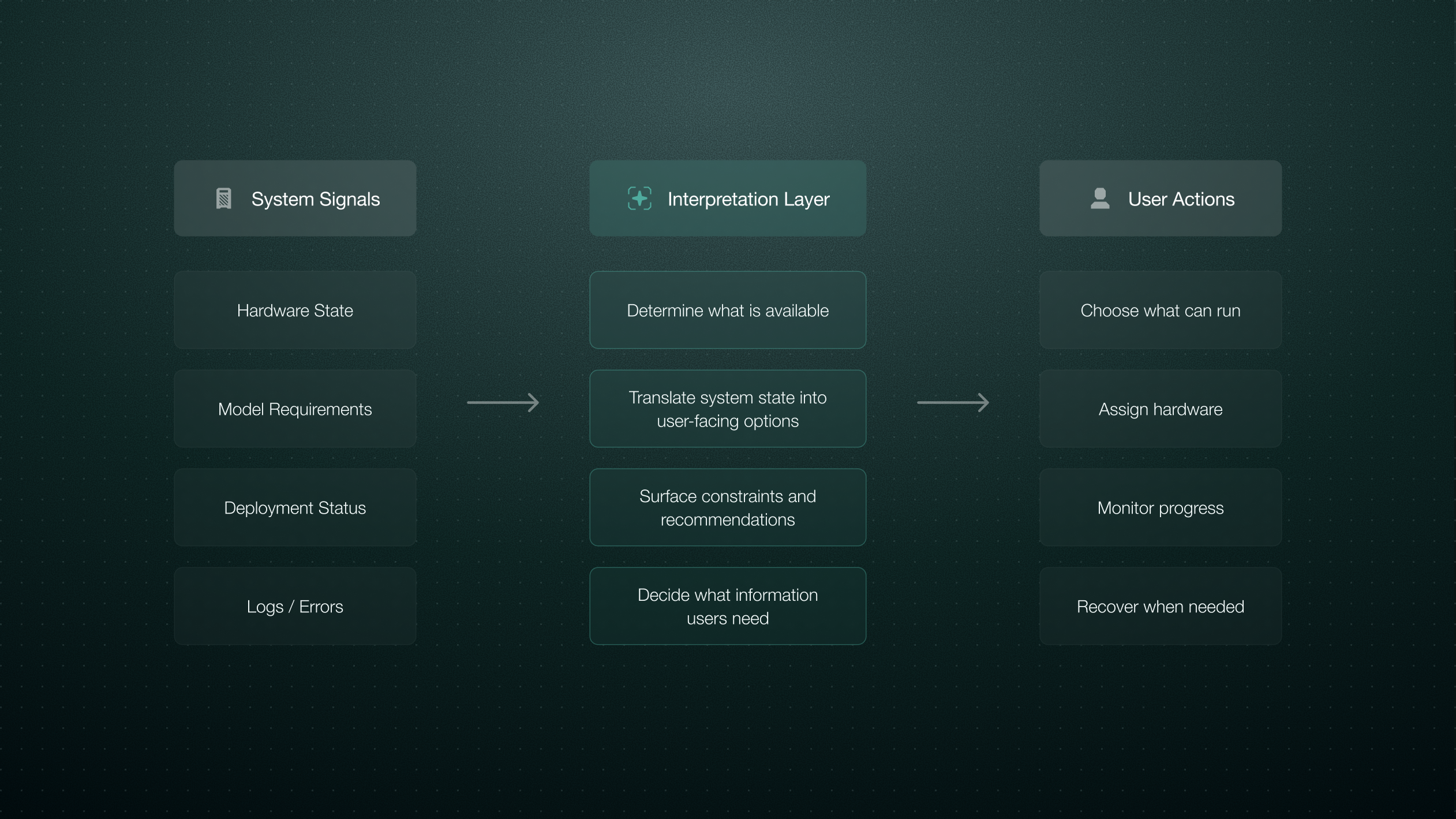
The original demo app organized information around backend output rather than user action. Our technical users needed to make a sequence of decisions, and my job was to define the product interpretation layer that turned system state into something they could reason about and act on.

The product problem diagram: system signals → interpretation layer → user actions.

Core decisions

Hardware you can act on

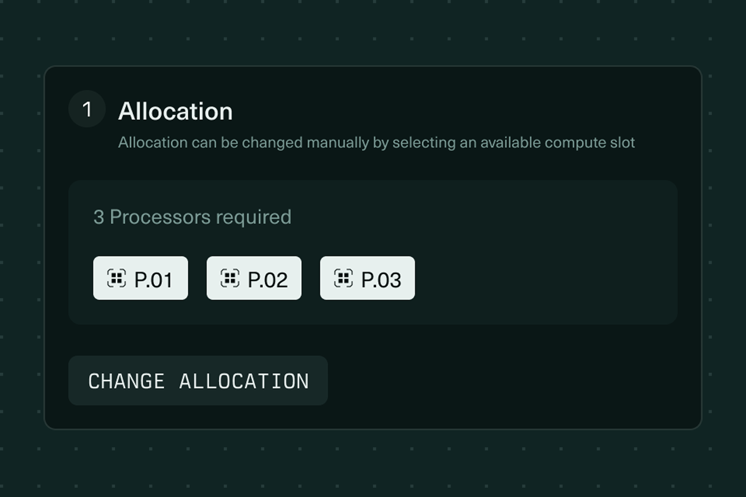
Processors became first-class objects, each showing its current state. When something changed, actions needed to live close to the object it affected. State and action, together.

P.01n300c
IDLE
RAM---
CPU---
Processor idle

Organized around the user's questions

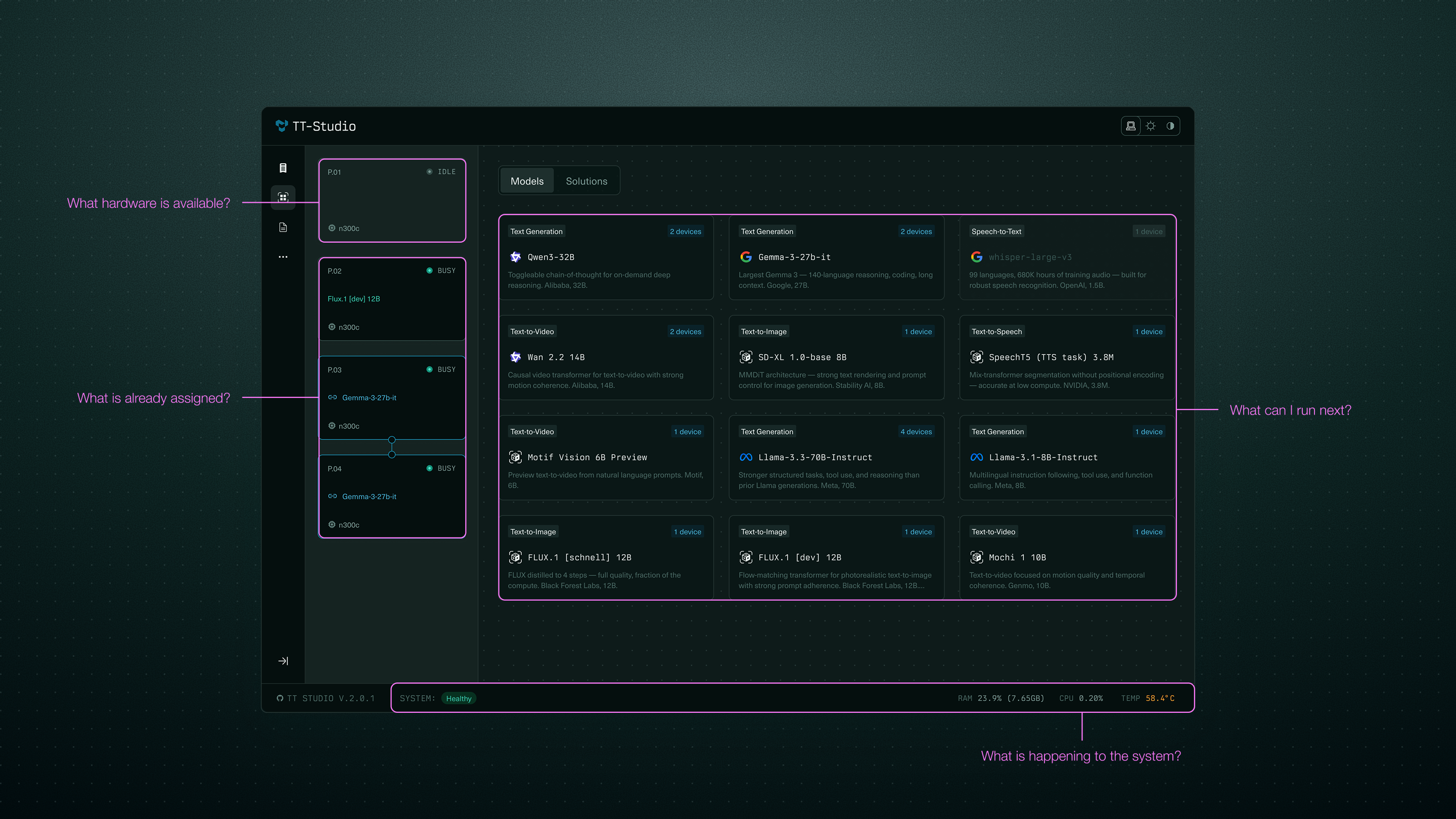
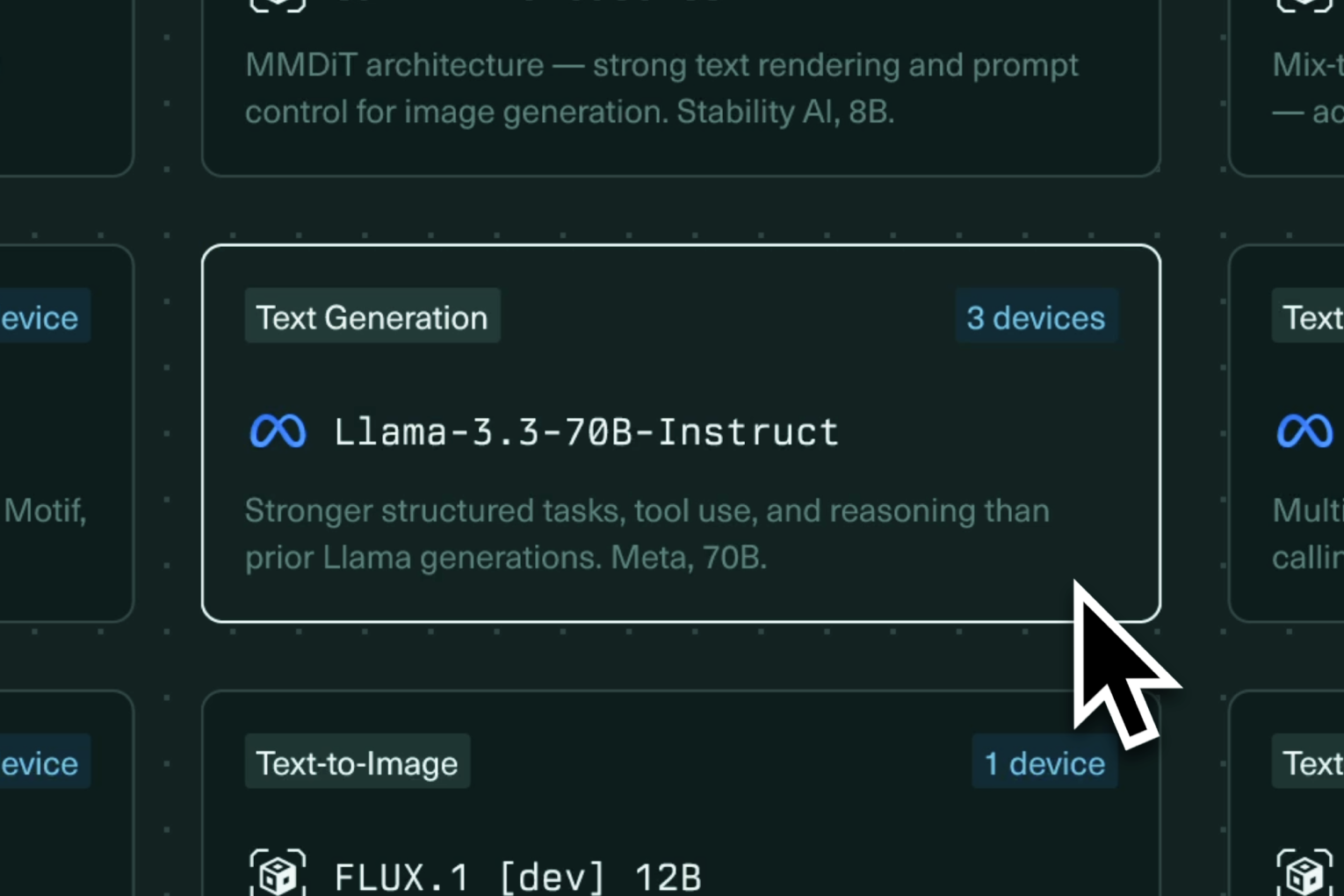
The backend had its own order of operations, but that was not the order a user needed to reason through a task. What hardware is available? What is already assigned? What can I run next?

Main workflow screen, annotated to the four questions.

Making system dependencies visible

The interface needed to show relationships, not just data. Selecting a model reveals compatible hardware; assigning it updates processor state; deploying changes what you can do next.

1. Select a model
1. Select a model
2. Show compatible hardware
3. Assign model workload
4. Hardware state updates for initial load
5. Deployment state
6. Deployed. Actions become available

Recovery lives next to the failure

If a processor failed, the user needed to know which one was affected and what actions were available. So the design moved recovery closer to the failed object. Logs remained available, but they were secondary.

Reducing ambiguity during long-running system states

Without clear feedback, waiting and failure can feel the same. So I designed reusable animated feedback states and status language to make the system feel responsive without making it noisy.

What the users taught us

We assumed developers would want TT-Studio as a persistent workspace, and built RAG management for exactly that. Early feedback from our open-source community showed that developers cared more about operational confidence: is the hardware working, can I run the model, do I understand what failed, and can I recover? That changed the product priority. We focused the experience around setup, deployment, system health, and recovery.

Reflection

The work we did on TT-Studio helped reduce time-to-use from 12 to 24 hours to roughly 20 to 60 minutes. That was not only a design achievement. It required cross-functional work across the software stack, because the design ask pushed the team to make the underlying setup and model-running experience much faster. My contribution was identifying the opportunity, making it tangible through a prototype, helping get the work resourced with CEO approval, and then defining the product model and interaction system that the team could build toward.

Clean Symphony hero — Convo with the ambient presence visible.

Symphony

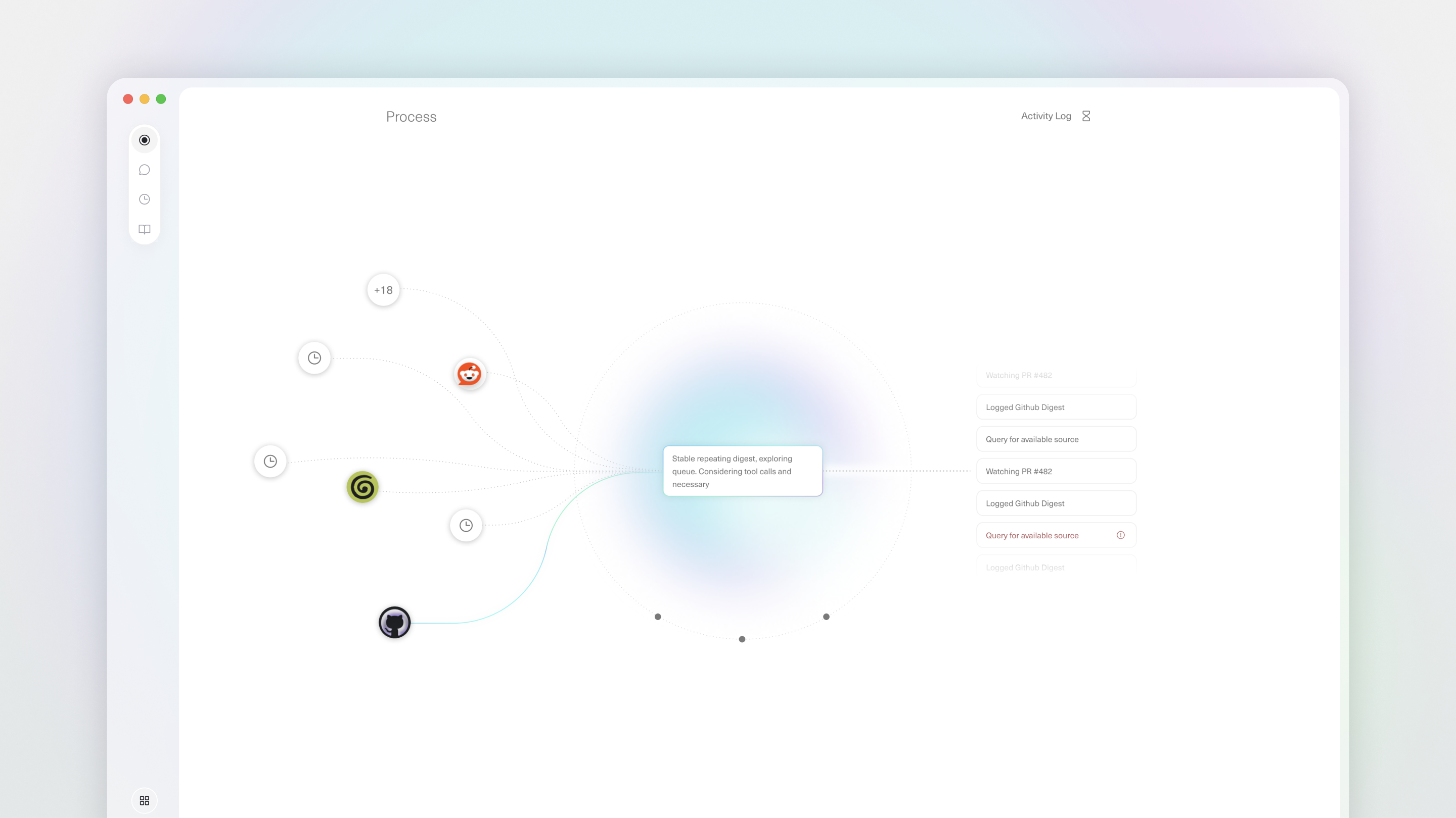
Symphony is the desktop interface for Truffle, a private local intelligence device. Truffle connects to your apps, works continuously in the background, and retrains toward you over time. The device's autonomy is both its largest value and largest user friction point: how do you trust a system that works while you're not watching?

I was brought in through Topiary to redesign the core surfaces of Symphony. My audit landed on an argument that shaped our engagement: trust couldn't live on a single page, it had to be embedded inside the entire experience.

Role
Product Design Consultant
Year
2026
Collaborators
  • Project Manager
  • Design Engineer
  • Founder
Tools
Figma, Cursor

Make background activity not only visible, but understandable.

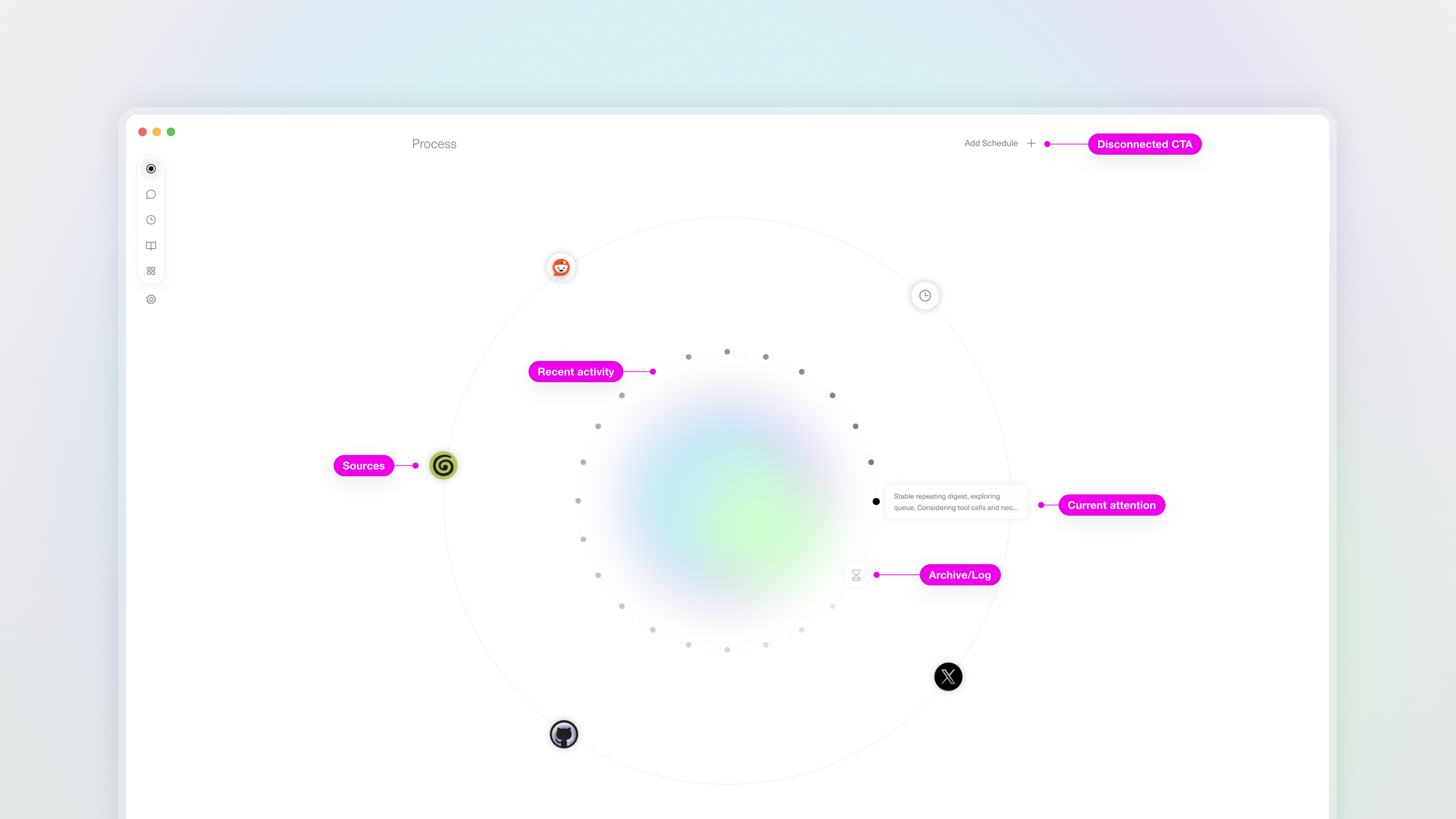
The Process page made Truffle's background activity visible, but the user still had to learn the metaphor before they could understand what was happening. That observation became the design opportunity.

The Process page as I found it, annotated: visible activity, hard to interpret.

I tested the page as live prototypes

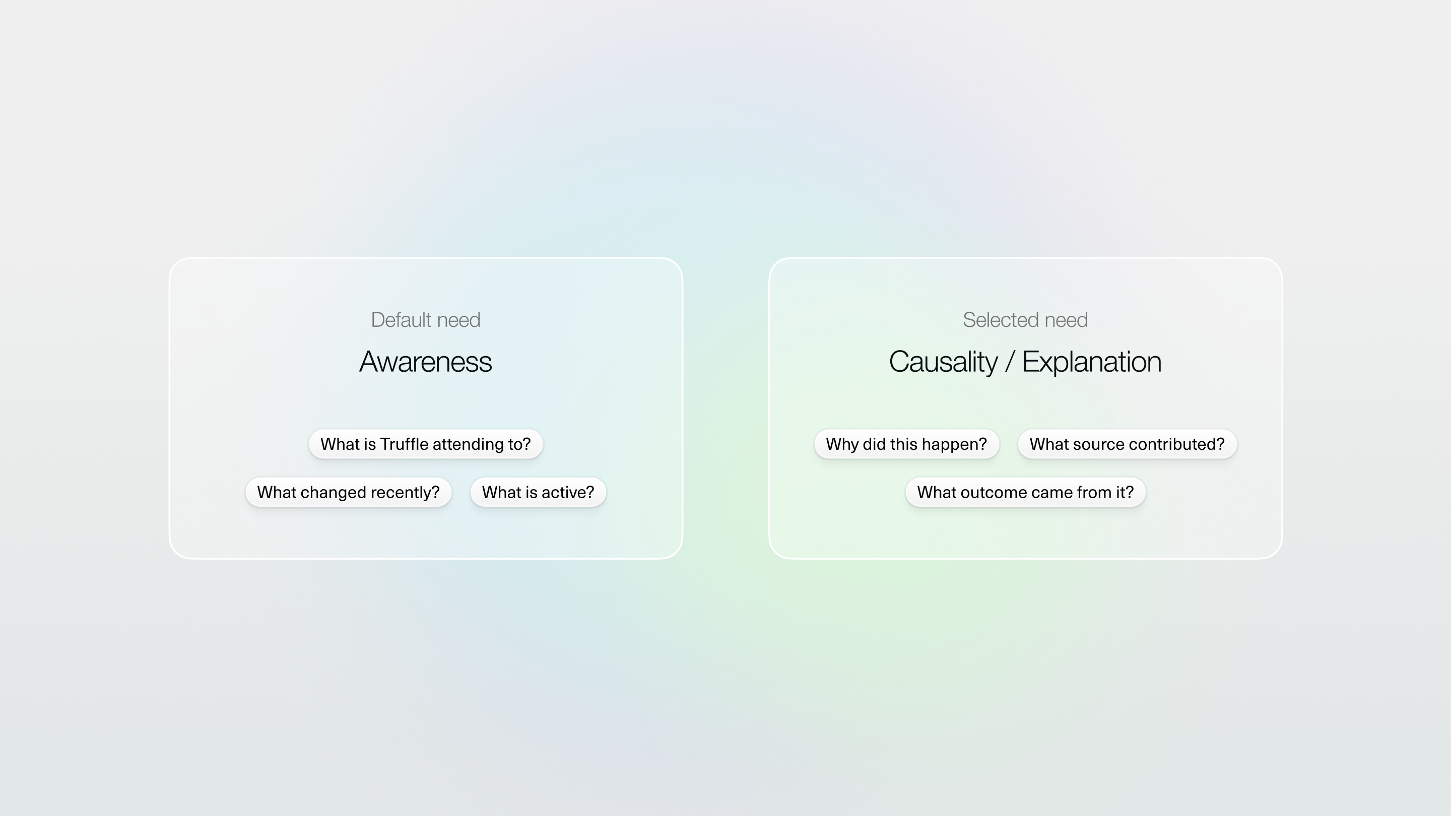
I built two competing mental models in code. The prototypes helped move discussion with the team away from “which visual direction feels better?” and toward “which mental model helps users understand autonomous work faster?”

Then the team took the argument further than I did

My case was that trust had to be integrated into the core product. The design engineer pushed it to its logical end; maybe the page shouldn't exist at all? That became our shared problem framing.

Before/after model: trust as a destination (a page) → trust as a layer.

Trust, dissolved into the core

I wanted to push the main chat interface into a more intelligent activity feed. One example of this was surfacing memory-creation events inline, so you see Truffle learning about you where you're already looking.

Building trust even in the simplest functions

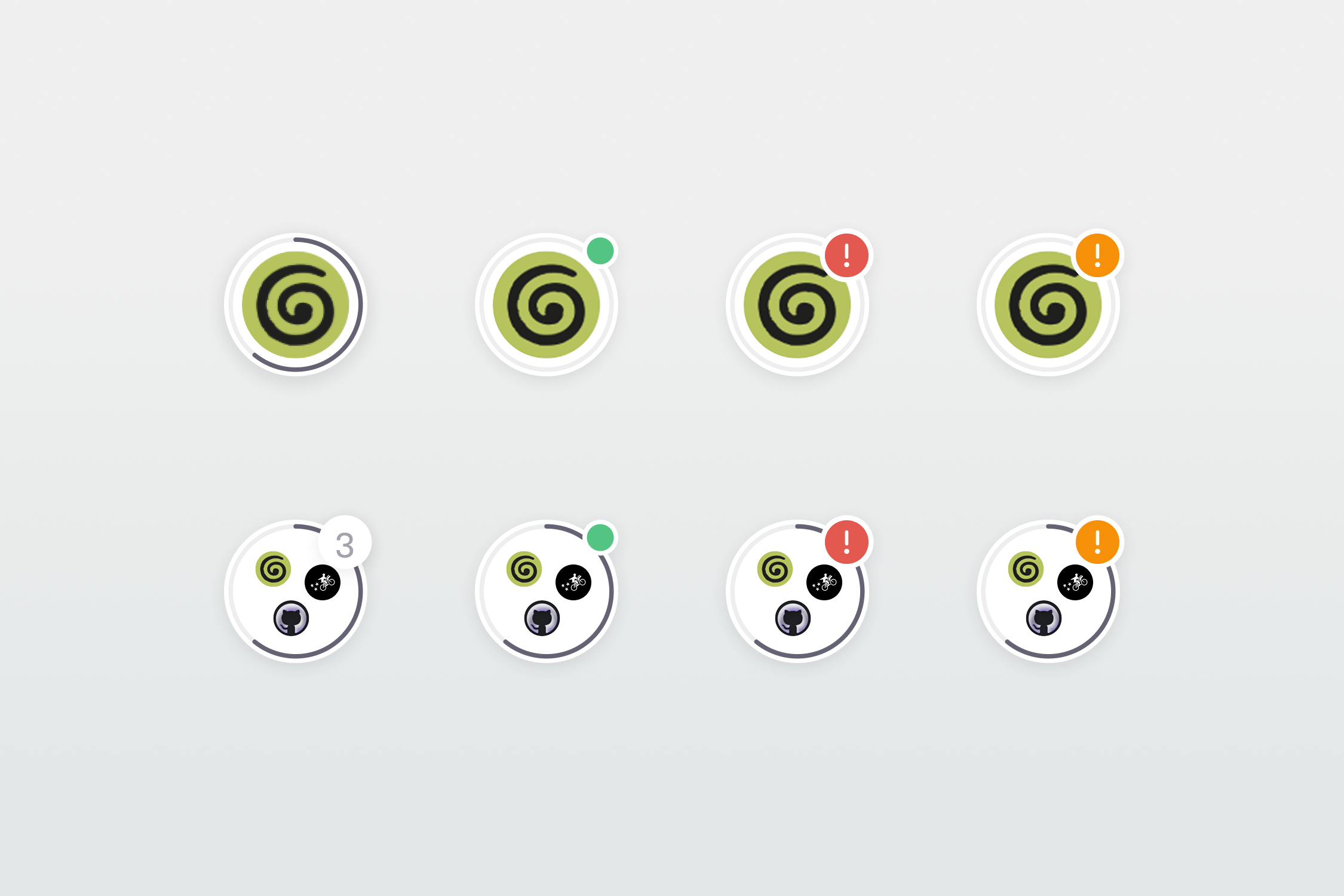
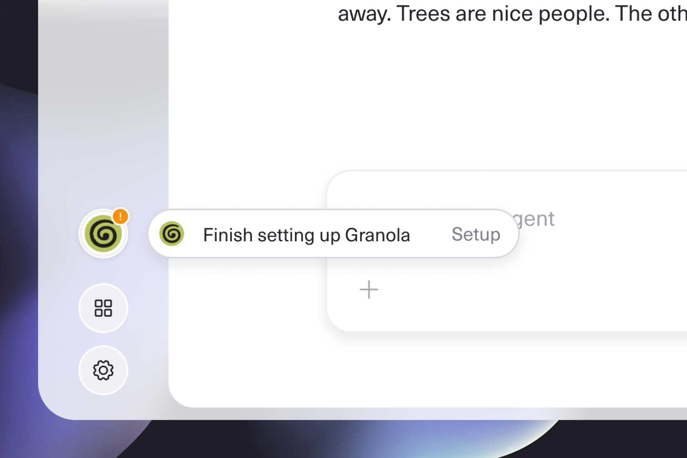
Users' confidence was lost during app installs. Installs needing further configuration gave no action signal, and app sources broke silently. I designed the state system as quiet, persistent notifications and honest error paths.

Install states: ambiguous before.
Action-needed + error-path after.

The old Onboarding flow had users downloading apps before they'd ever seen the product. I redesigned the experience to set the user up with appropriate context then land them on the App Install page, where the state system was already working in real time.

Reconfiguring the system underneath

Another result of the work was rebuilding Symphony's design system with token architecture and components that could scale alongside a Design Engineer-led team.

Reflection

Early improvements are already live in Symphony, and a larger redesign is in progress ahead of upcoming GTM launch initiatives. The work I contributed merges background activity and the chat feed into a more integrated experience, so the agent's process and the conversation sit closer together instead of on two separate surfaces.

The biggest takeaway from this project was that trust doesn't come from showing users a page of activity. It comes from what the product surfaces, what it holds back, and whether it tells you when something breaks.

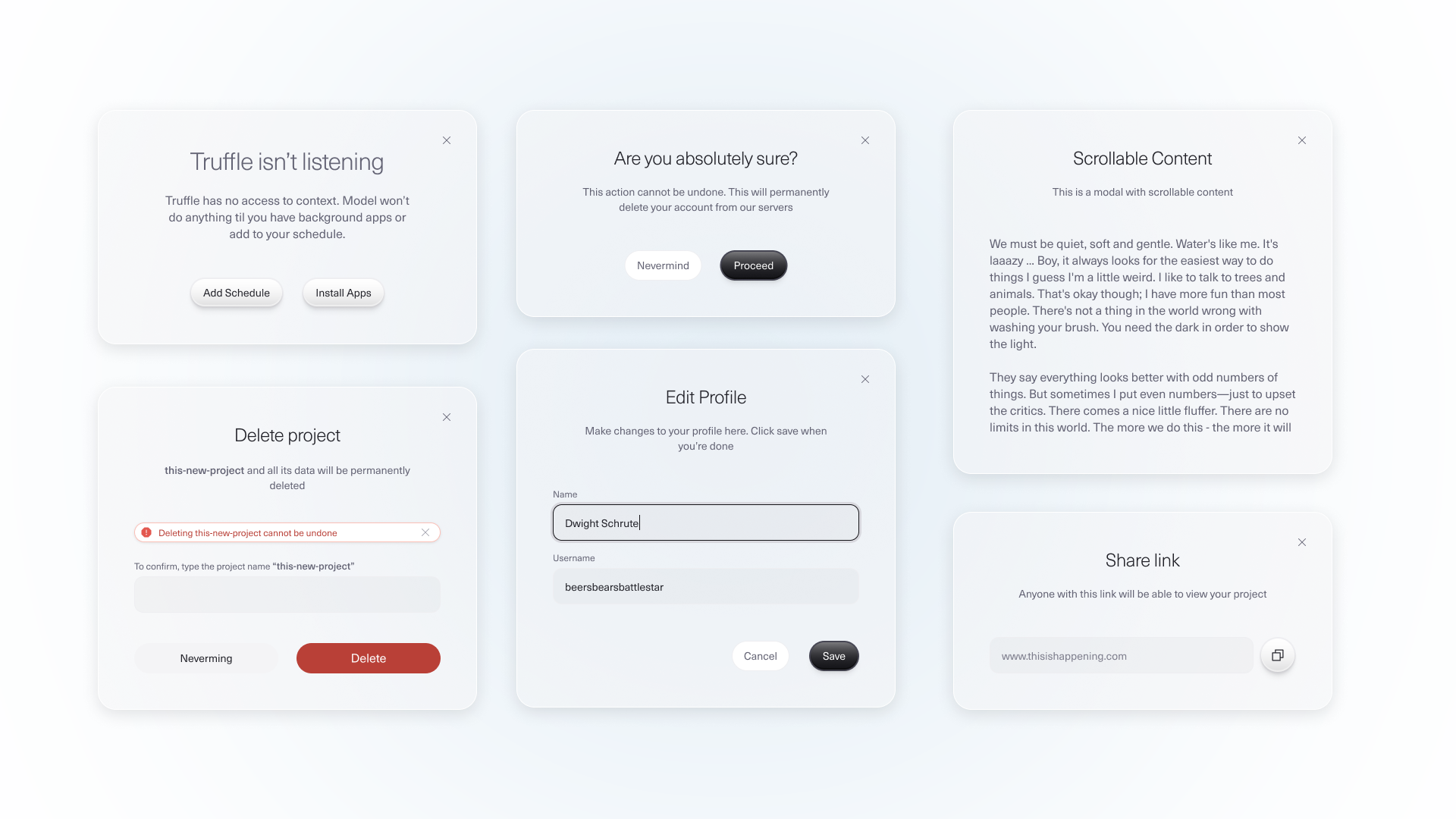
Vesper system overview — components, tokens, states (Storybook / Figma).

Vesper Design System

Vesper is Tenstorrent's product design system. It's built so engineers, and increasingly AI coding agents, can build coherent, on-brand interfaces without a designer in the room.

Vesper emerged from a pattern I kept seeing: our engineering teams were shipping internal demos that were built quickly and in isolation, and design was pulled in late when something suddenly had to look polished.

I diagnosed the issue as an organization-level design problem, brought it to leadership, and got buy-in. I designed the system and the first iteration of its structure, then partnered with two front-end engineers to make the system legible to the people building with it.
Role
Creator & Lead Designer
Duration
2025-2026
Team
2 Front-End Engineers
Tools
Figma, Storybook, Cursor

Designing the architecture

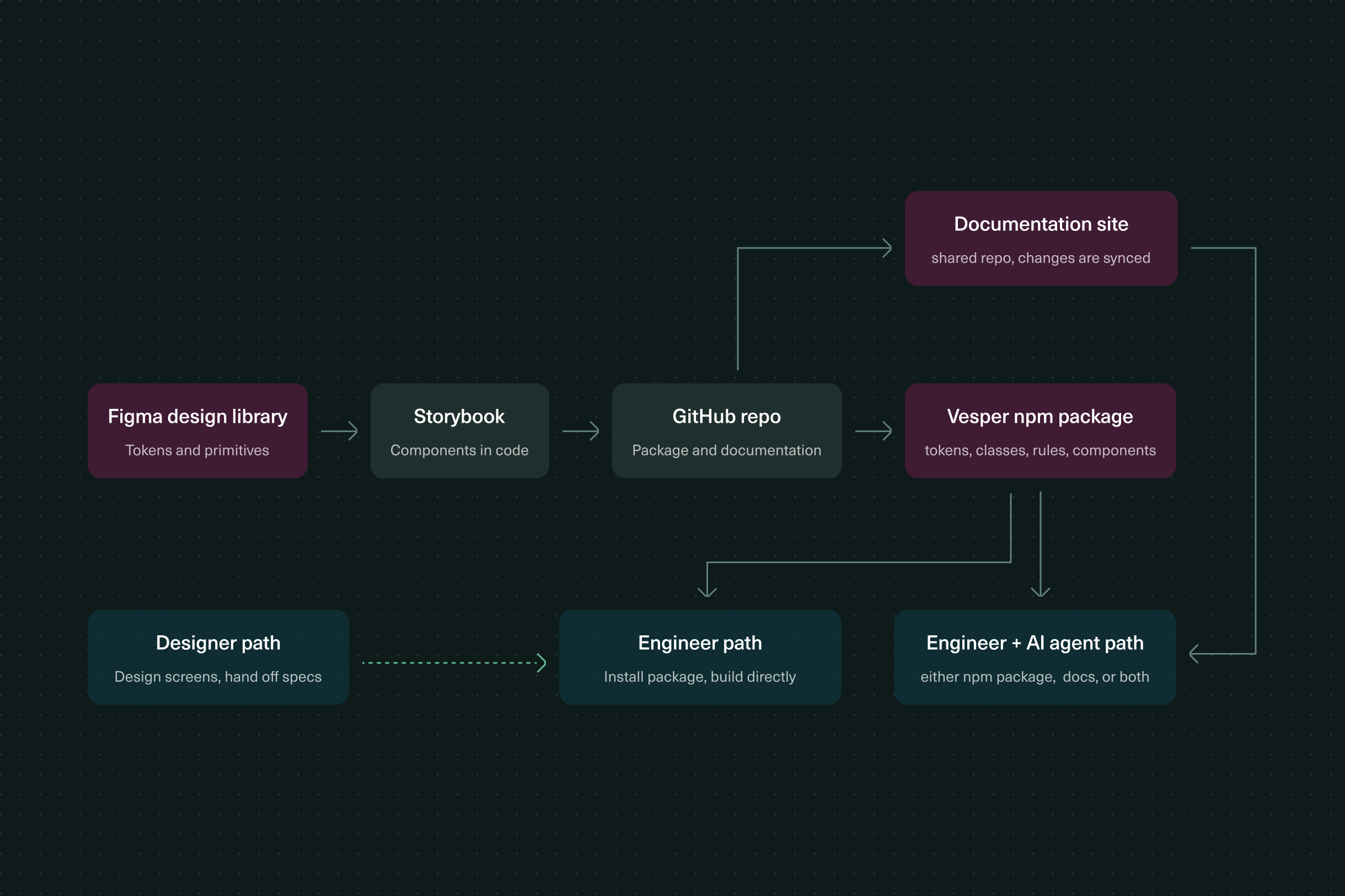
I designed Vesper and built the first iteration of its structure. Then I partnered with two front-end engineers who shaped how to make the system legible to engineers, including how we adapt it to existing internal products.

The architecture chart: how the system is organized.

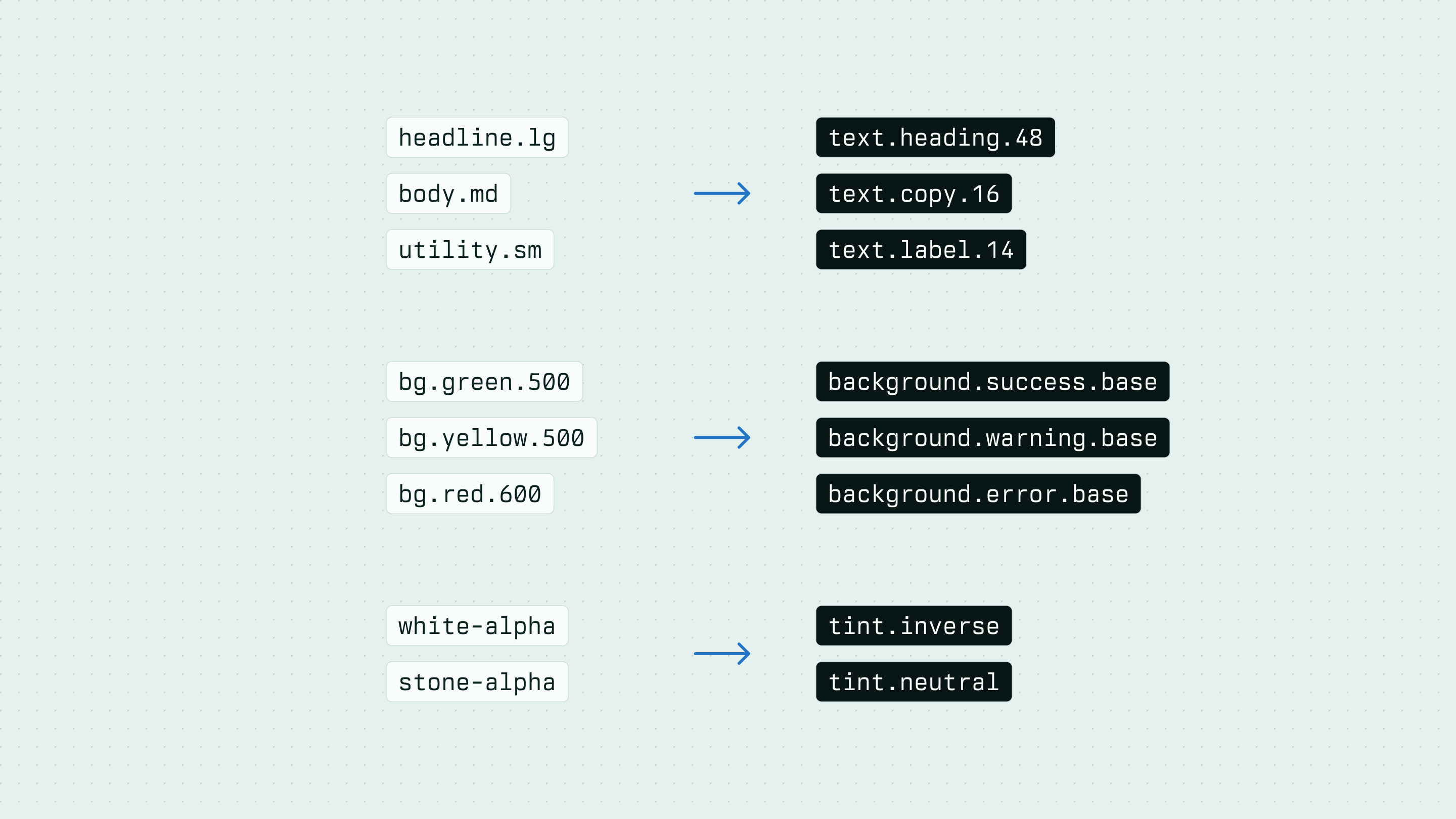
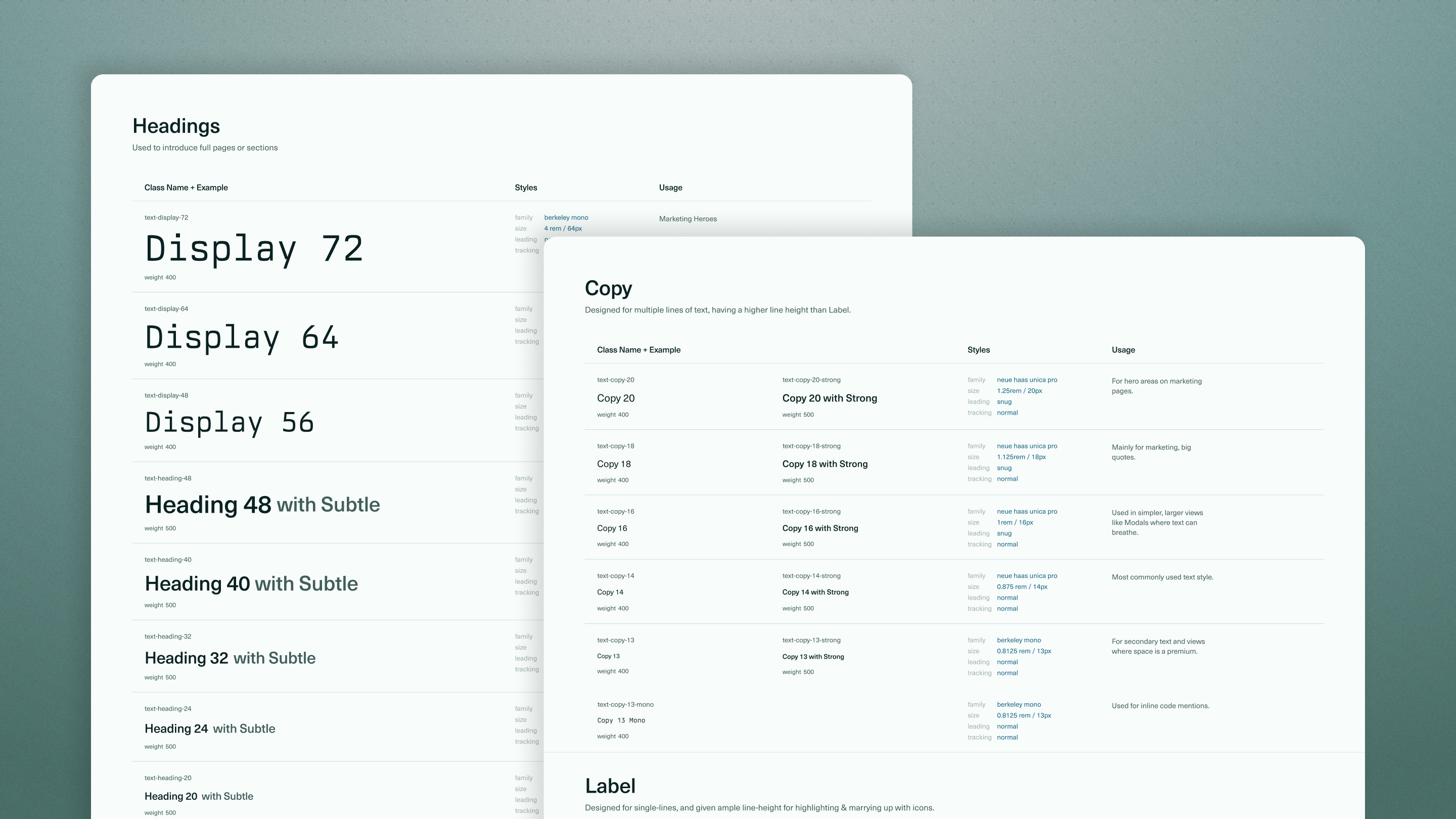
Semantic tokens optimized for intent

Rather than describing what a token looks like, Vesper describes why it exists, making token selection more predictable for both engineers and AI agents.

Token naming: implementation-state examples from Storybook and Figma.

Deciding between prescriptive and fluid rules

A big part of Vesper has been setting up usage rules. Which tokens and patterns are locked, where engineers and agents have freedom, and how the rules travel with the package instead of living with me. Vesper ships as an installable package with its documentation and usage rules built in, so the default way to start a build is the governed way.

Components designed around product behavior

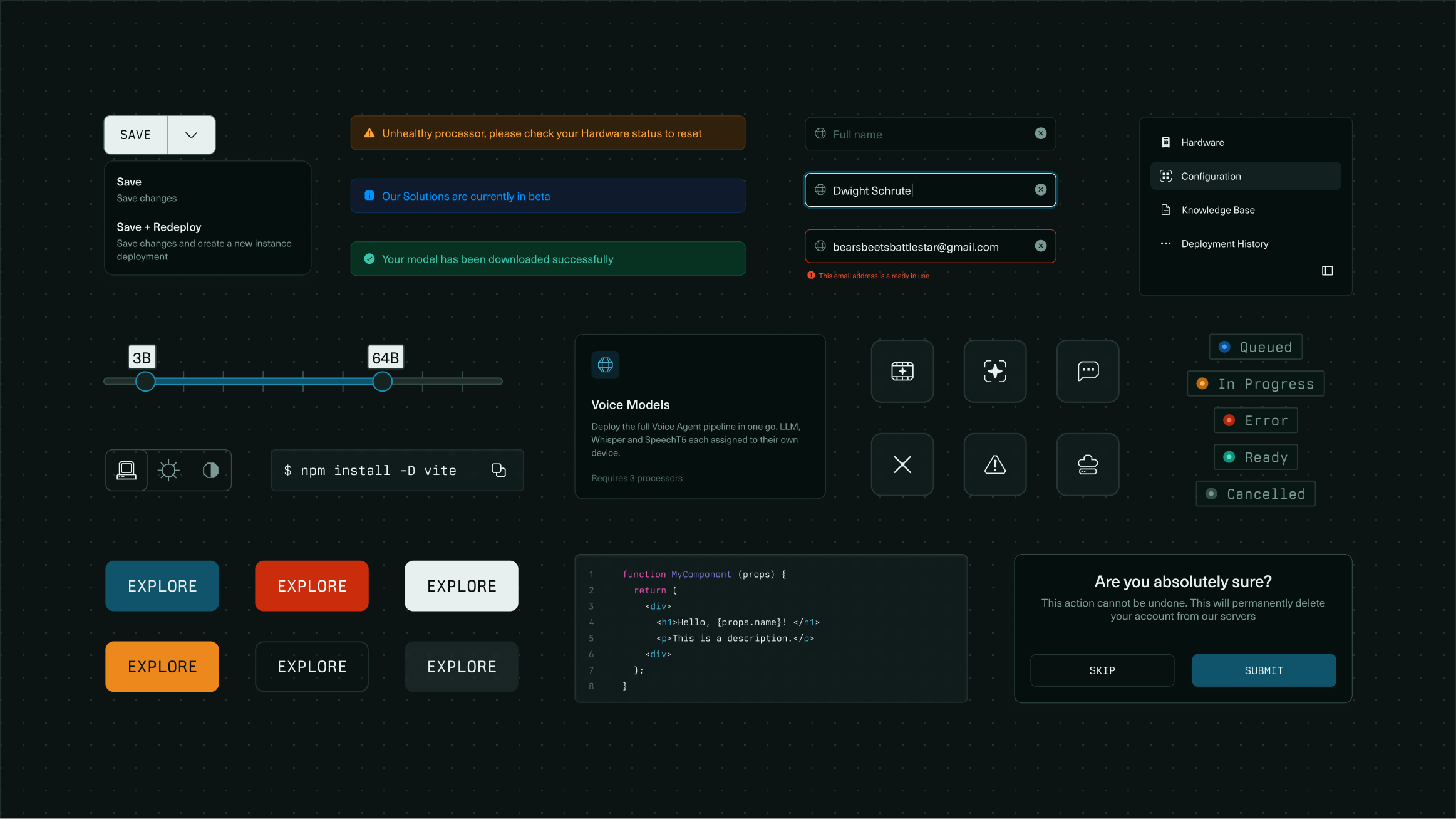
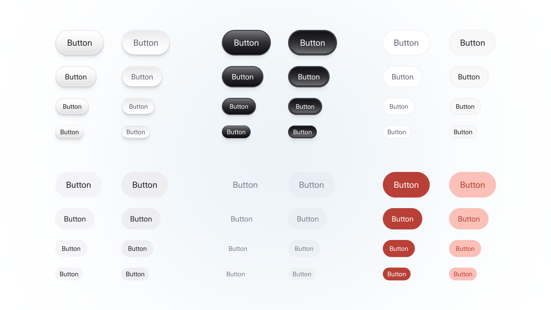
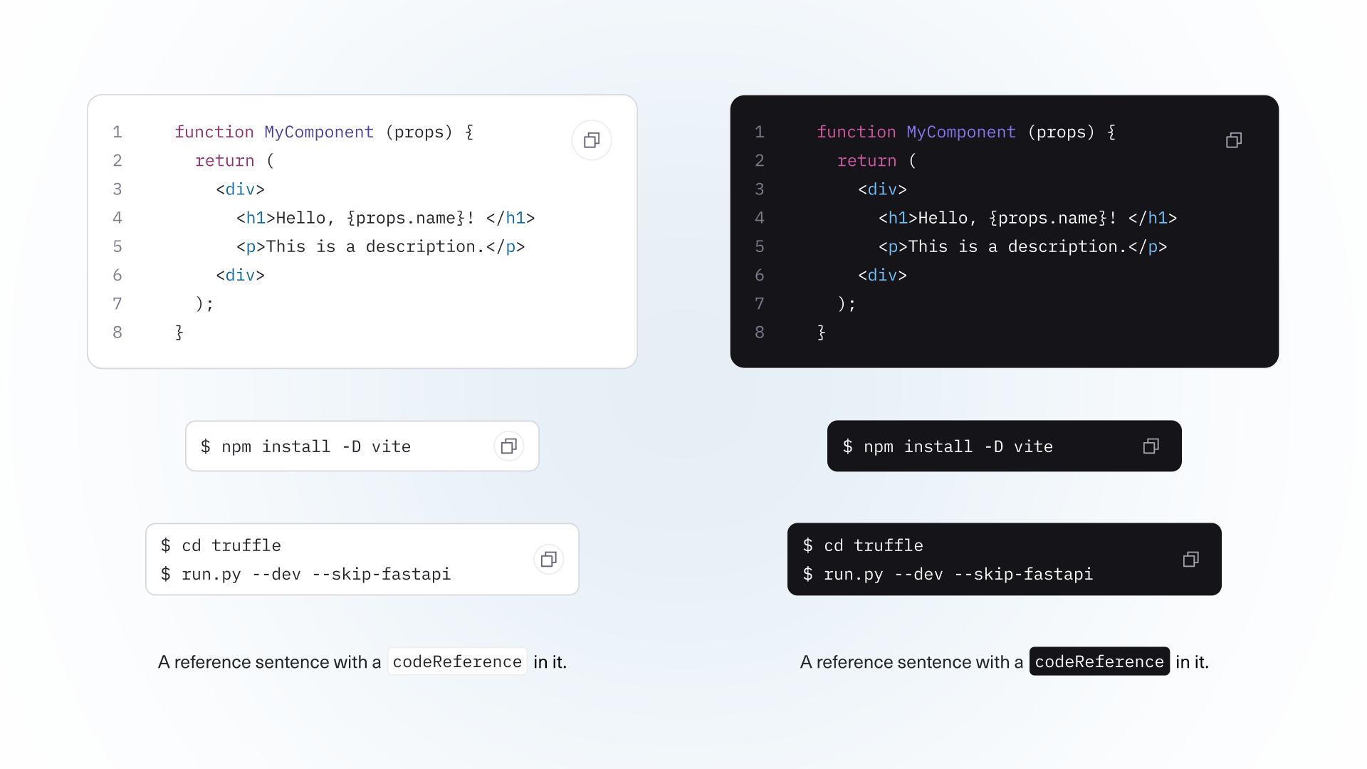
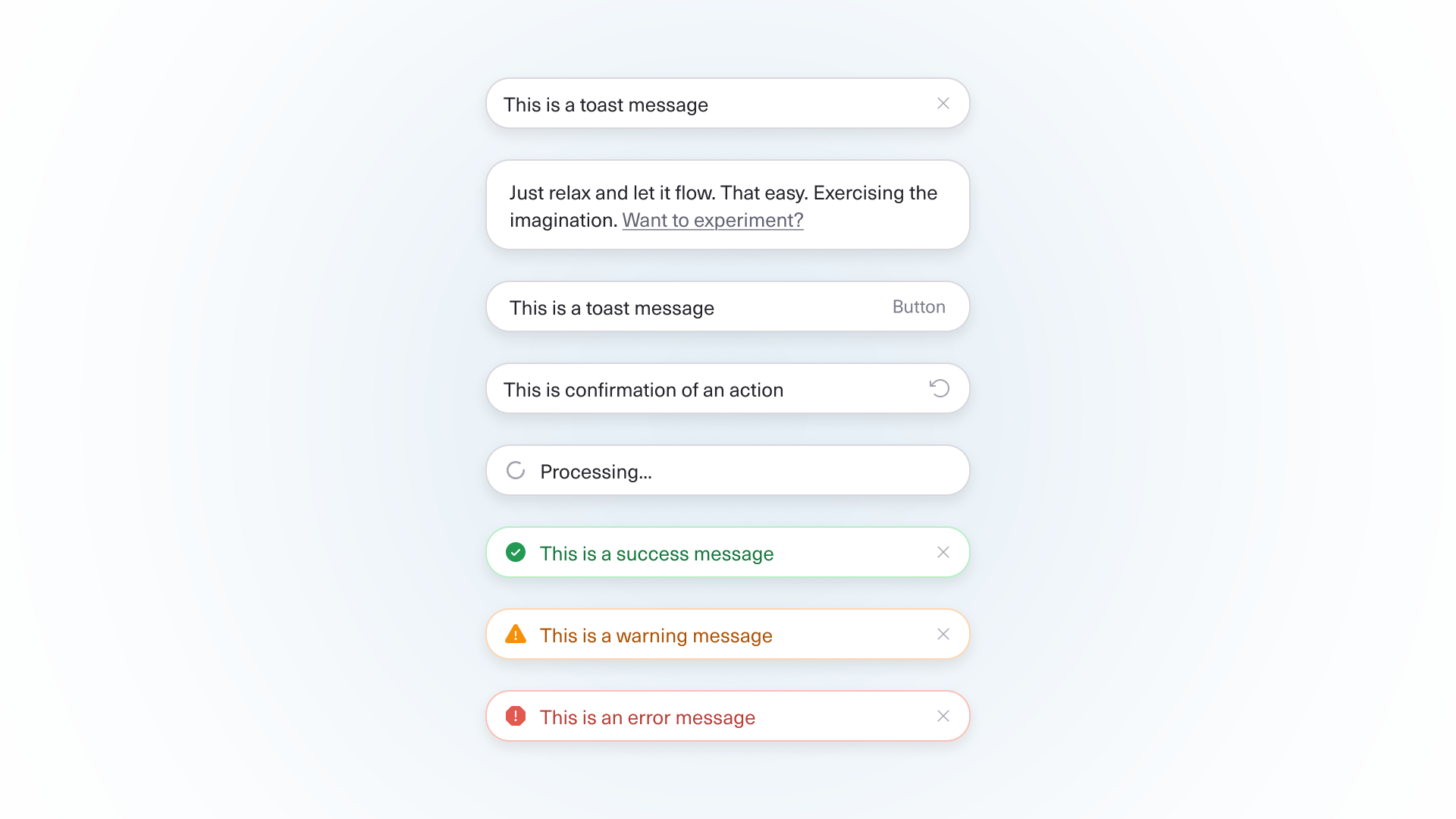
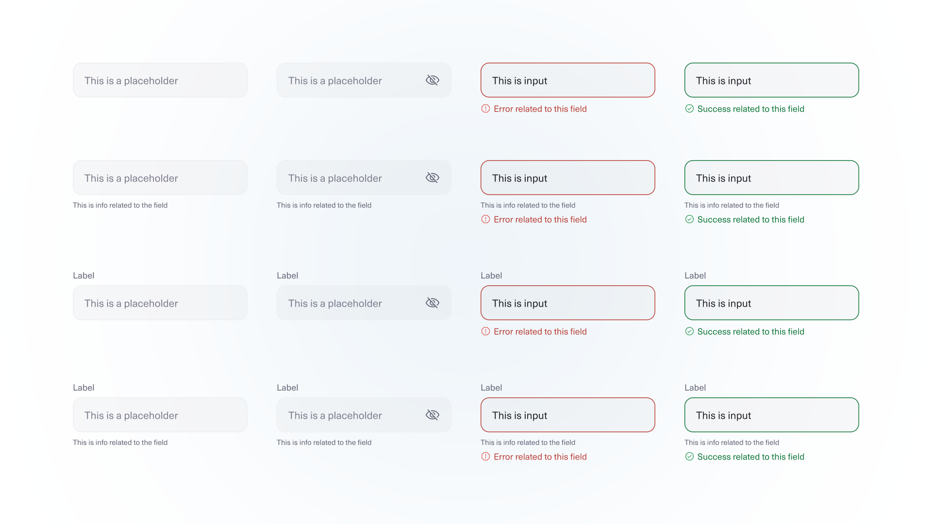
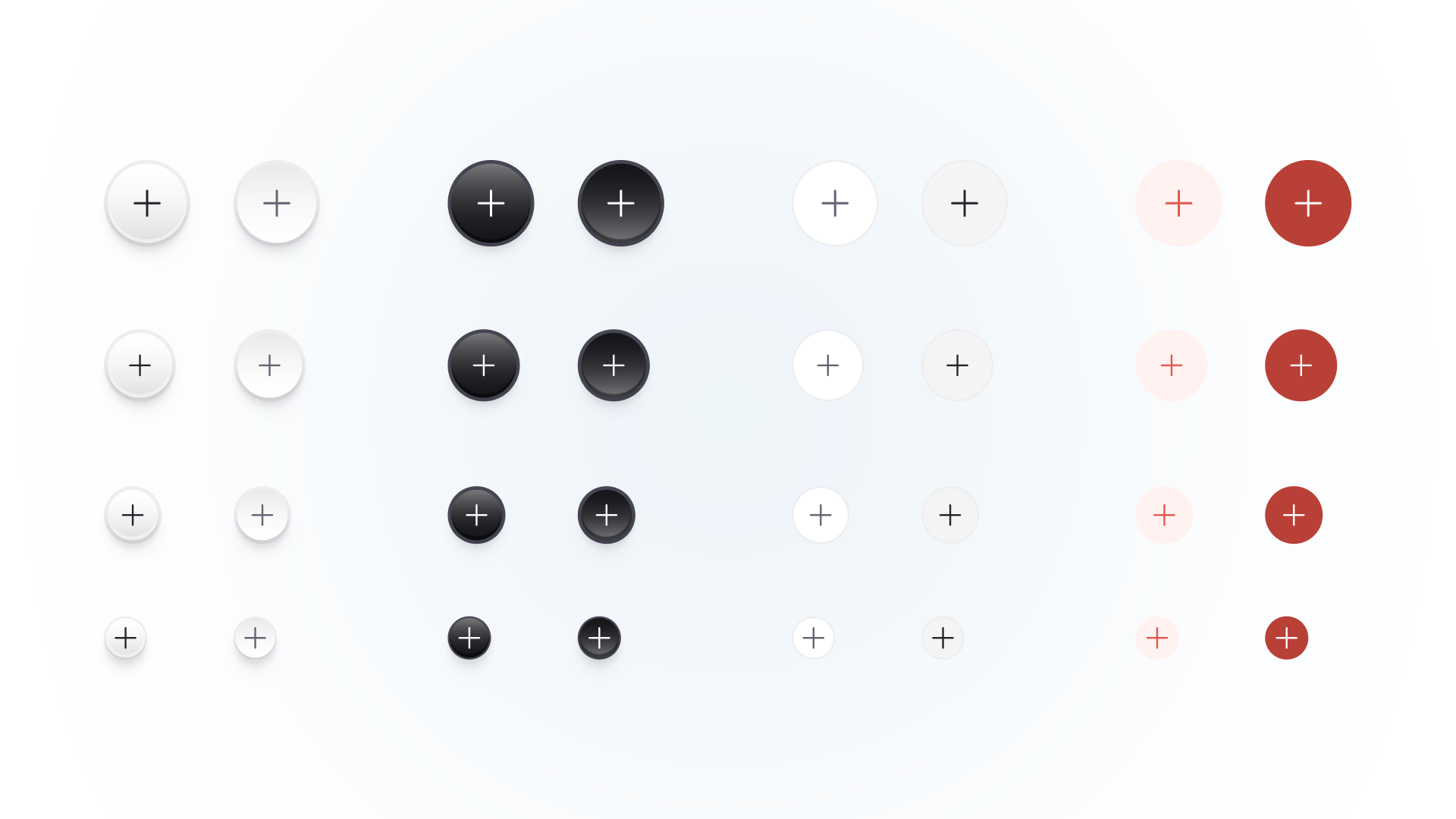
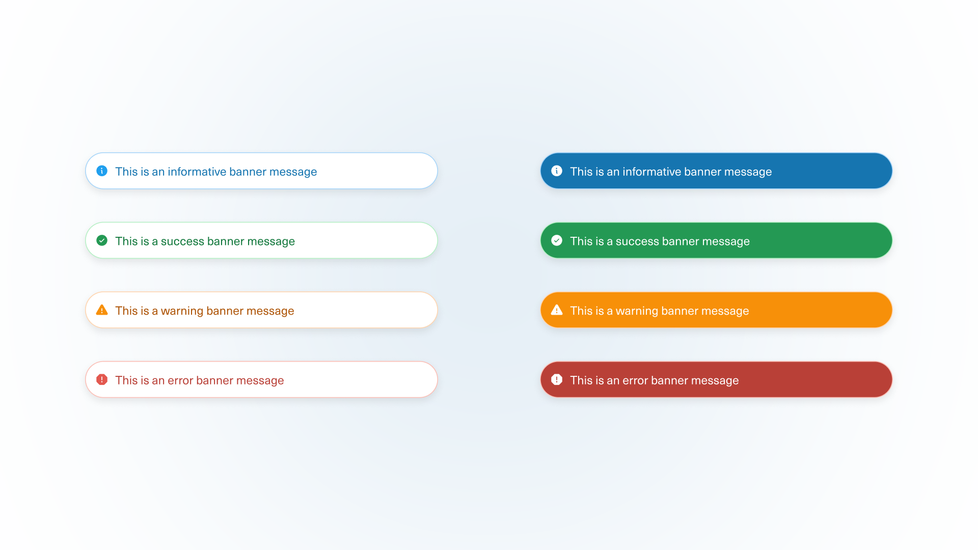
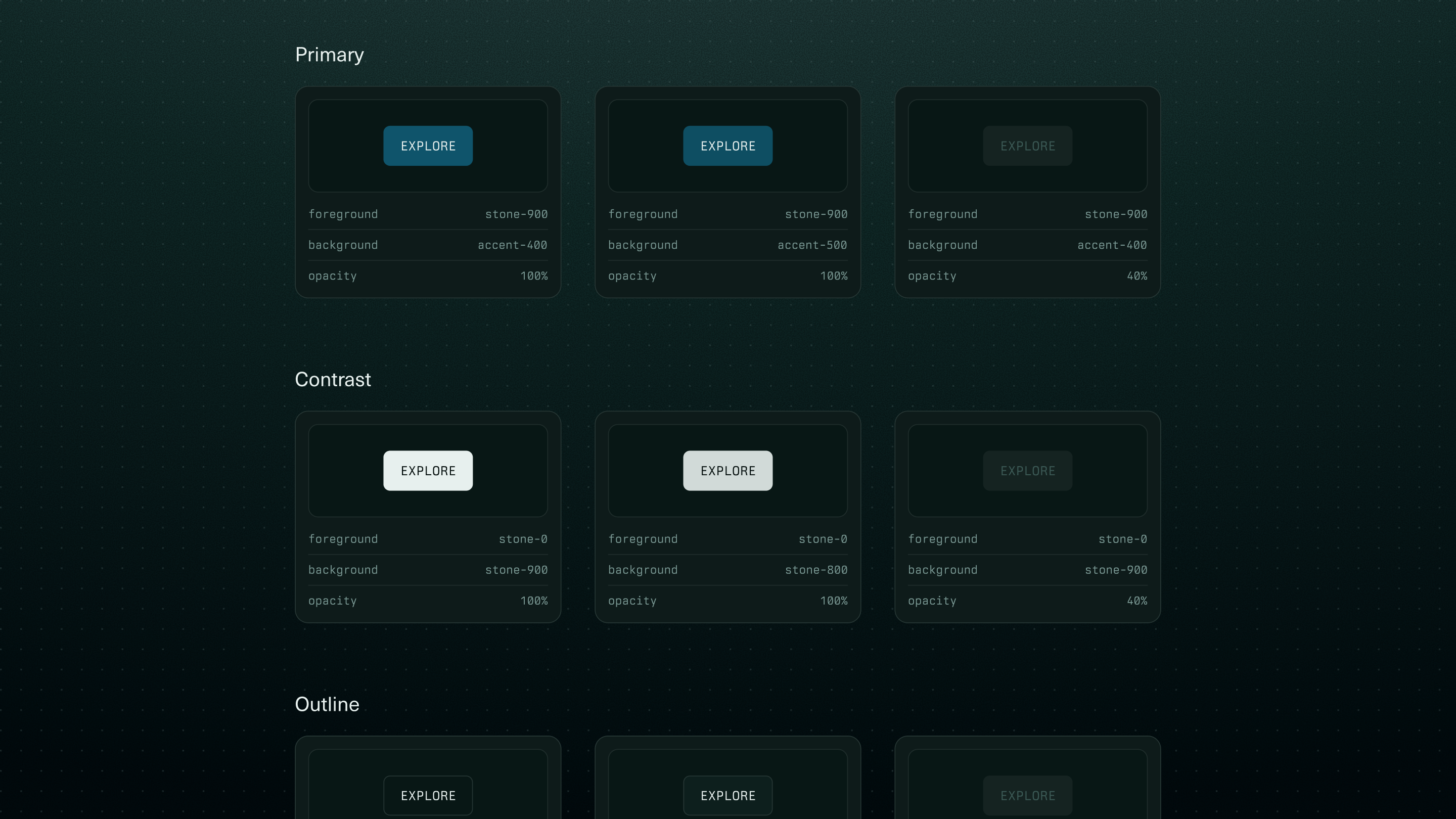
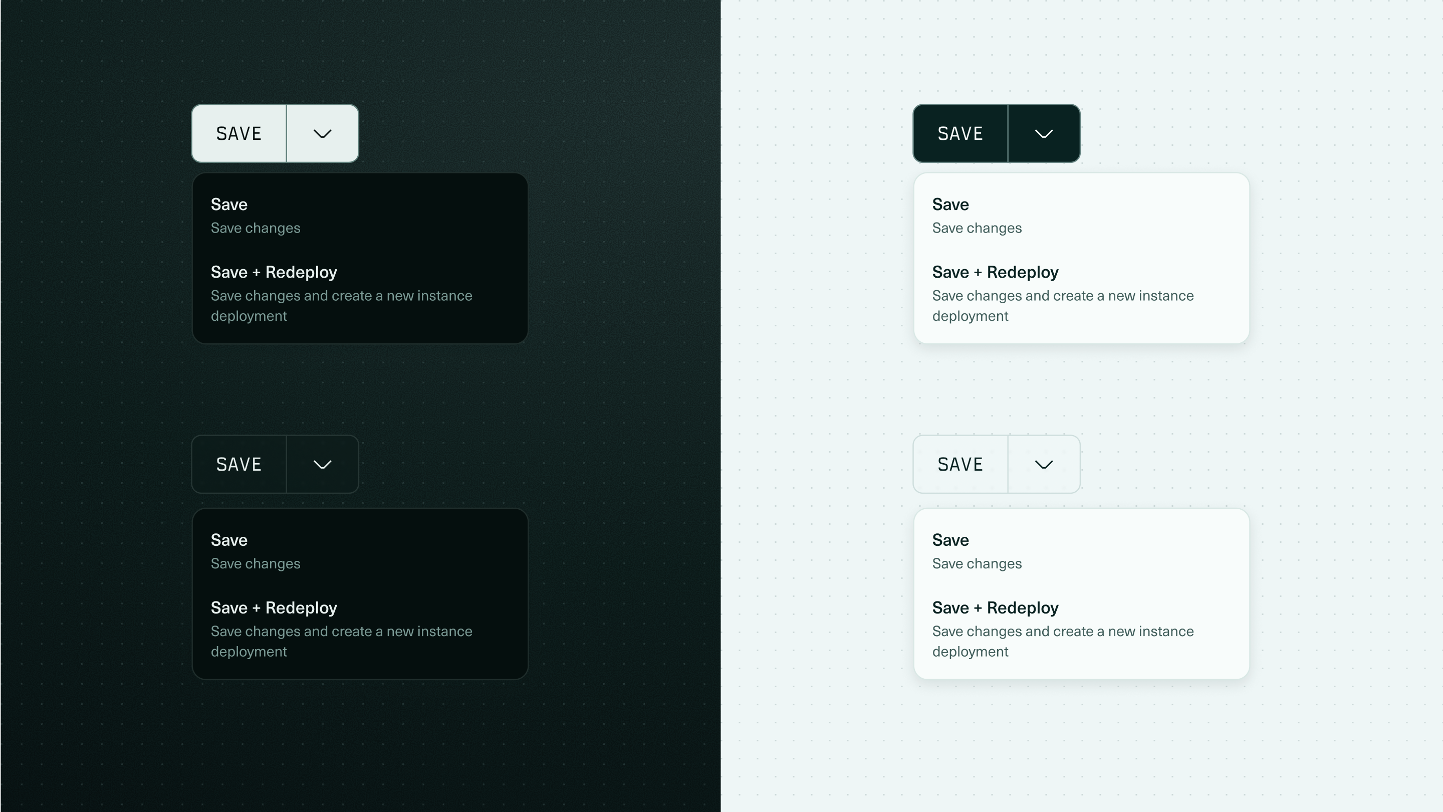
Every component encodes behavior such as states, variants, and usage rules. All components were built in dark and light modes from the start.

Vesper component close-up 1 of 5 — states and variants in depth.Vesper component close-up 2 of 5 — states and variants in depth.Vesper component close-up 3 of 5 — states and variants in depth.Vesper component close-up 4 of 5 — states and variants in depth.Vesper component close-up 5 of 5 — states and variants in depth.

A system beyond Figma

Vesper is made to be used by designers in Figma, by engineers building without a designer, and by AI coding agents. The full component library lives in Storybook, with the tokens, states, and guidance needed to build a coherent surface without me in the loop.

Where it's headed

Vesper's visual identity grew as an extension of the digital brand system I built for Tenstorrent's digital marketing surfaces. My larger initiative was to design Tenstorrent's entire ecosystem, making sure all digital surfaces started to feel intentional and from the same family. Vesper has been tested first in TT-Studio, and the packaged, agent-ready version is in build now. It will roll out first to developer relations, as the team that ships demos most often. This way the most visible surfaces become coherent by default.

Reflection

Vesper is the work I'm proudest of because it changes how the org builds, not just how a screen looks. As AI writes more of the UI, the systems that hold quality can't be legible to humans only. They have to be legible to the engineers and agents building together.